February 2022
The Virtuous Book
A typographic exploration of page and book design.
Book Design, Page Design, Graphic Design
February 2022
The Virtuous Book
A typographic exploration of page and book design.
Book Design, Page Design, Graphic Design
February 2022
The Virtuous Book
A typographic exploration of page and book design.
Book Design, Page Design, Graphic Design
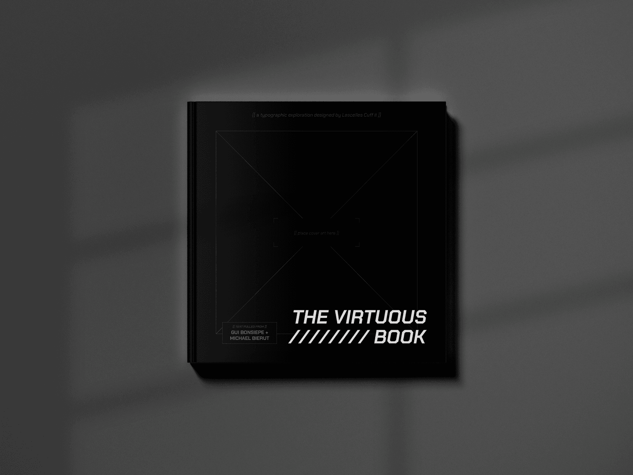
The Virtuous Book is a 52-page book created for the purposes of exploring type pairings and the flow of book design.
The Virtuous Book contains text from Gui Bonsiepe’s Some Virtues of Design and Michael Bierut’s essay, Why Designers Can’t Think, from his 79 Short Essays on Design series. Thus, The Virtuous Book itself is a catalog of design, exploring the topic visually through my page layouts, as well as contextually, through the content which can be read within.
As stated before, The Virtuous Book was created to explore type pairings. Chakra Petch and Apparat were the two type families that informed the look of The Virtuous Book. Chakra Petch is a geometrical typeface, giving a tech-forward look to the exploration. Apparat is the supporting body text — a clean, modern sans serif typeface that prioritizes readability.
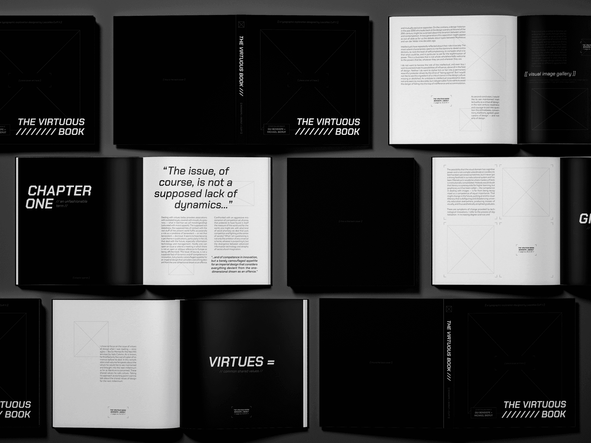
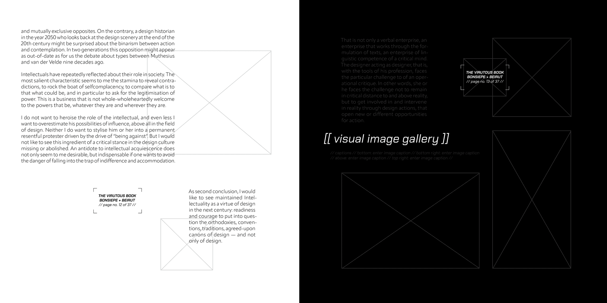
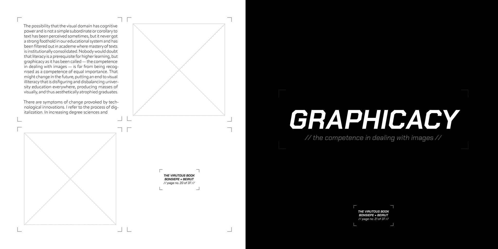
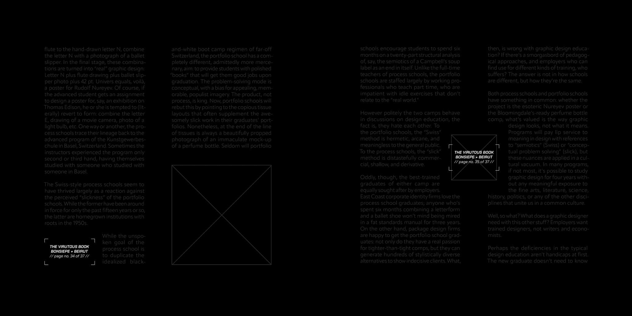
Various spreads from The Virtuous Book, including the front and back covers.
The look of The Virtuous Book was mainly influenced by its primary typeface, Chakra Petch. Upon experimenting with this typeface in the project's early design stages, I knew I wanted to create a book that explored 'meta-design' as I coined it.
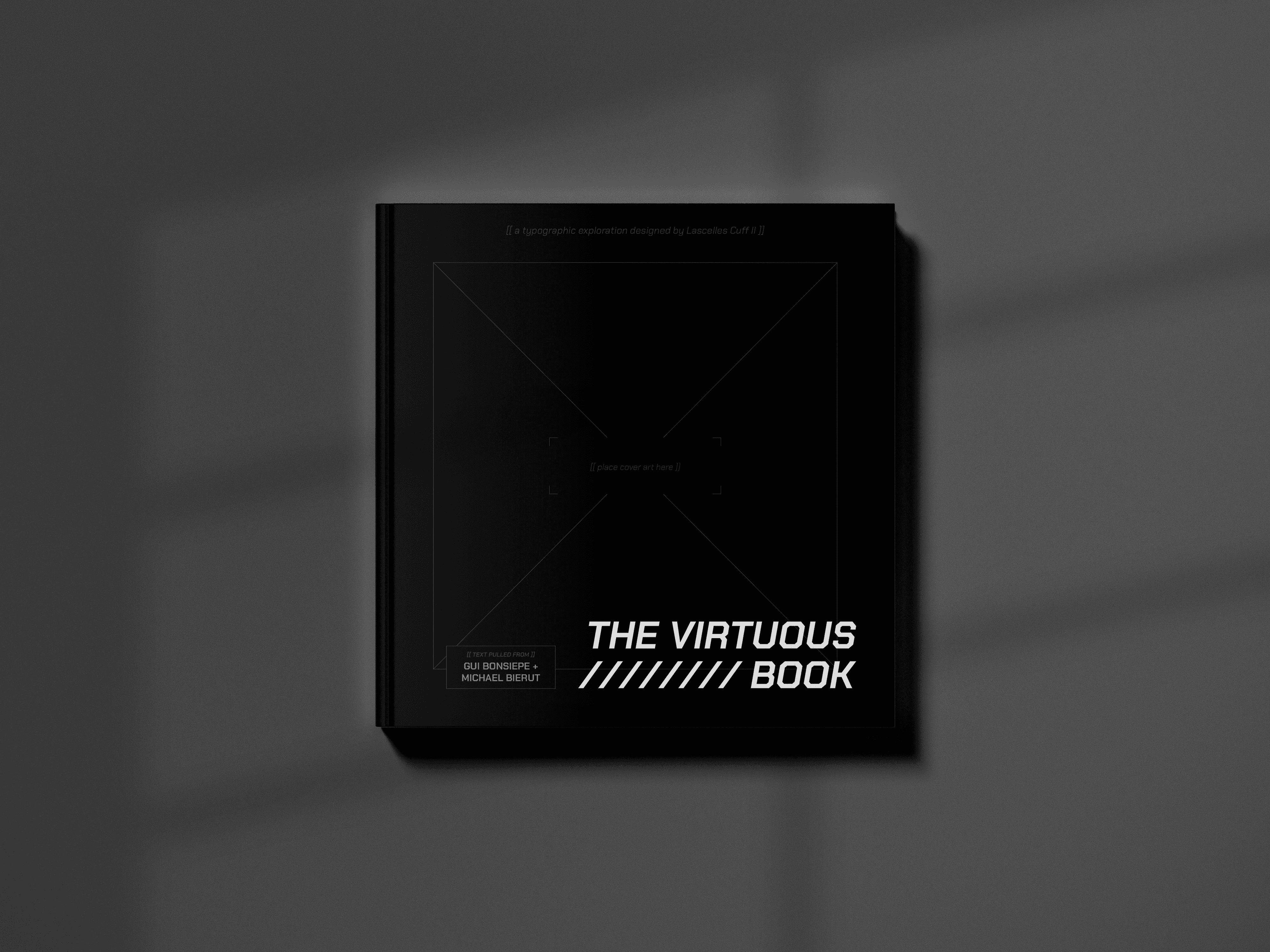
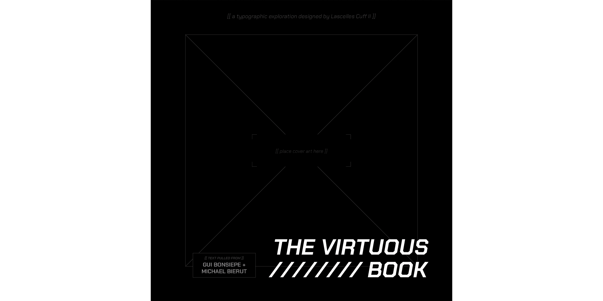
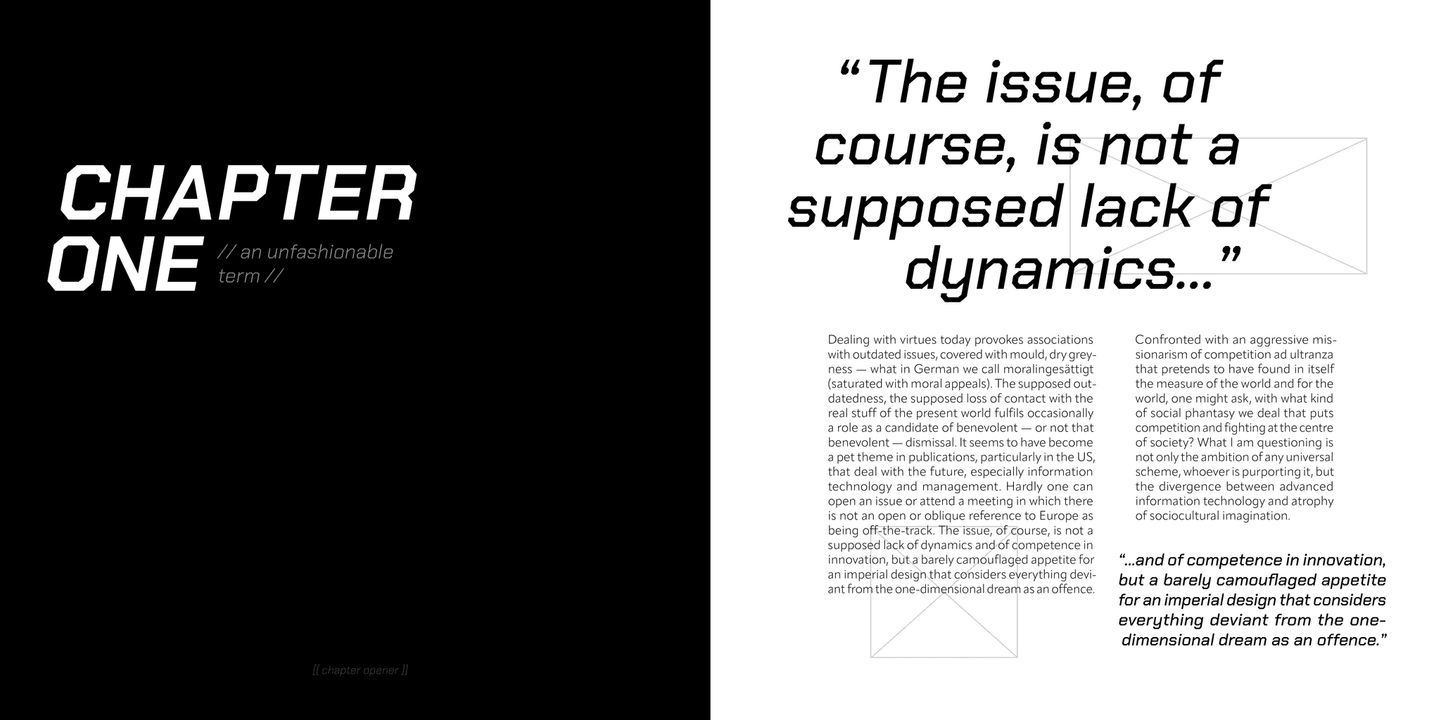
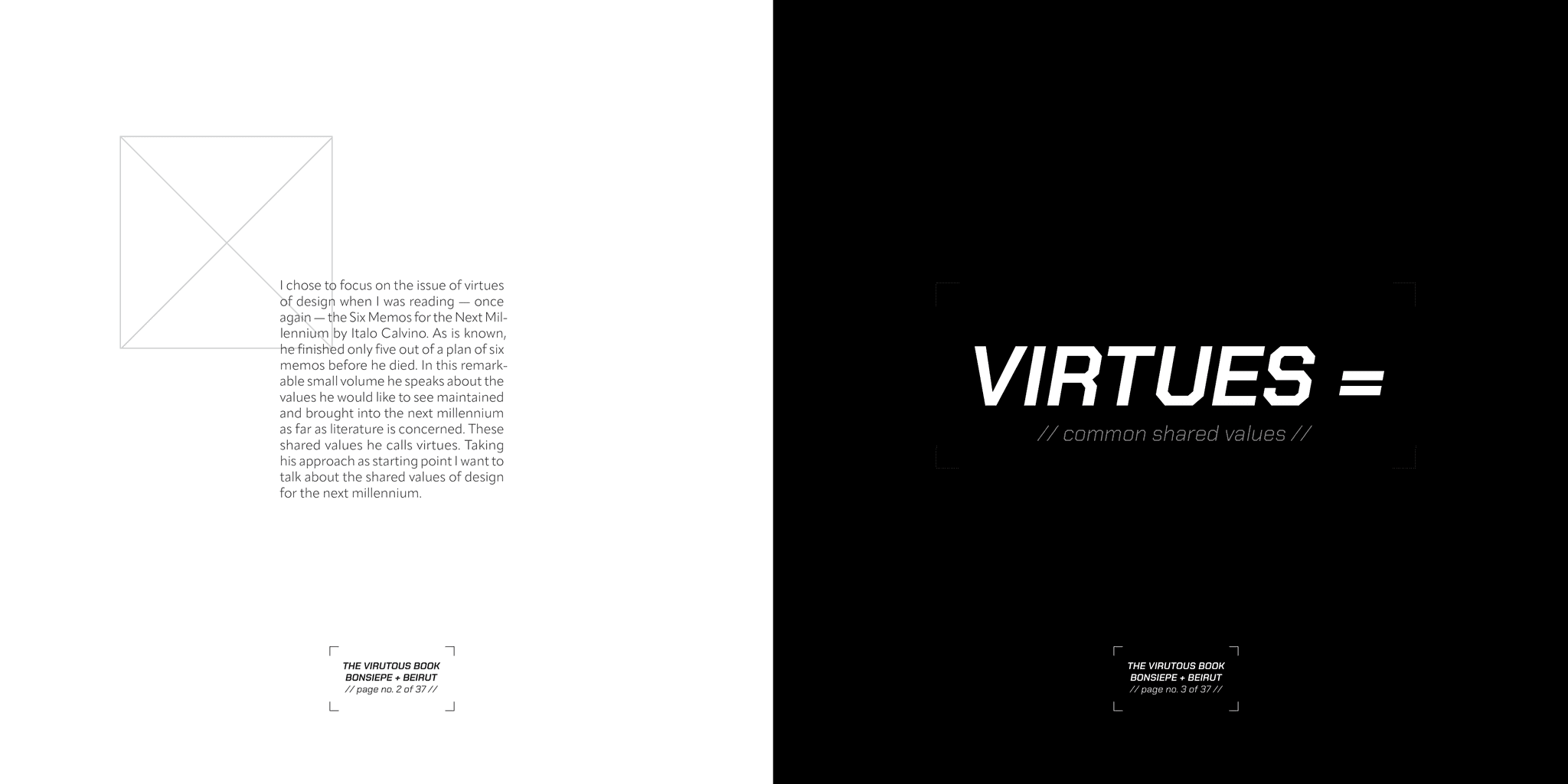
Meta-design looks at design itself and comments on the process, breaking the fourth wall and having the design speak towards the reader themselves. For example, empty image bounding boxes — where pictures should be — are used heavily throughout its pages. Even more, the cover exclaims 'place cover art here', crop marks become design elements, and forward slashes '//' and bracket marks '[ ]' contain information such as page numbers and chapter titles.

The front cover of The Virtuous Book.
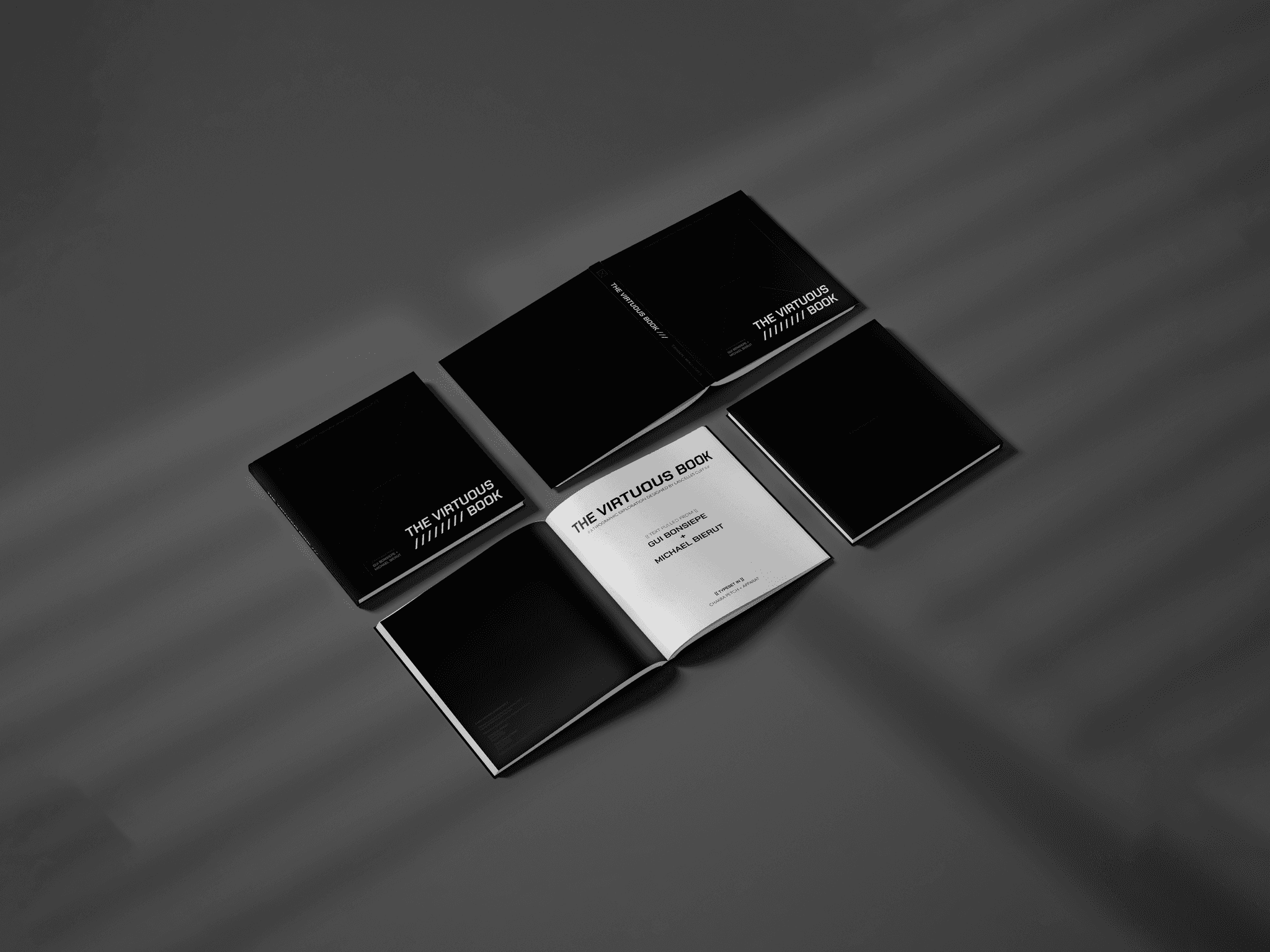
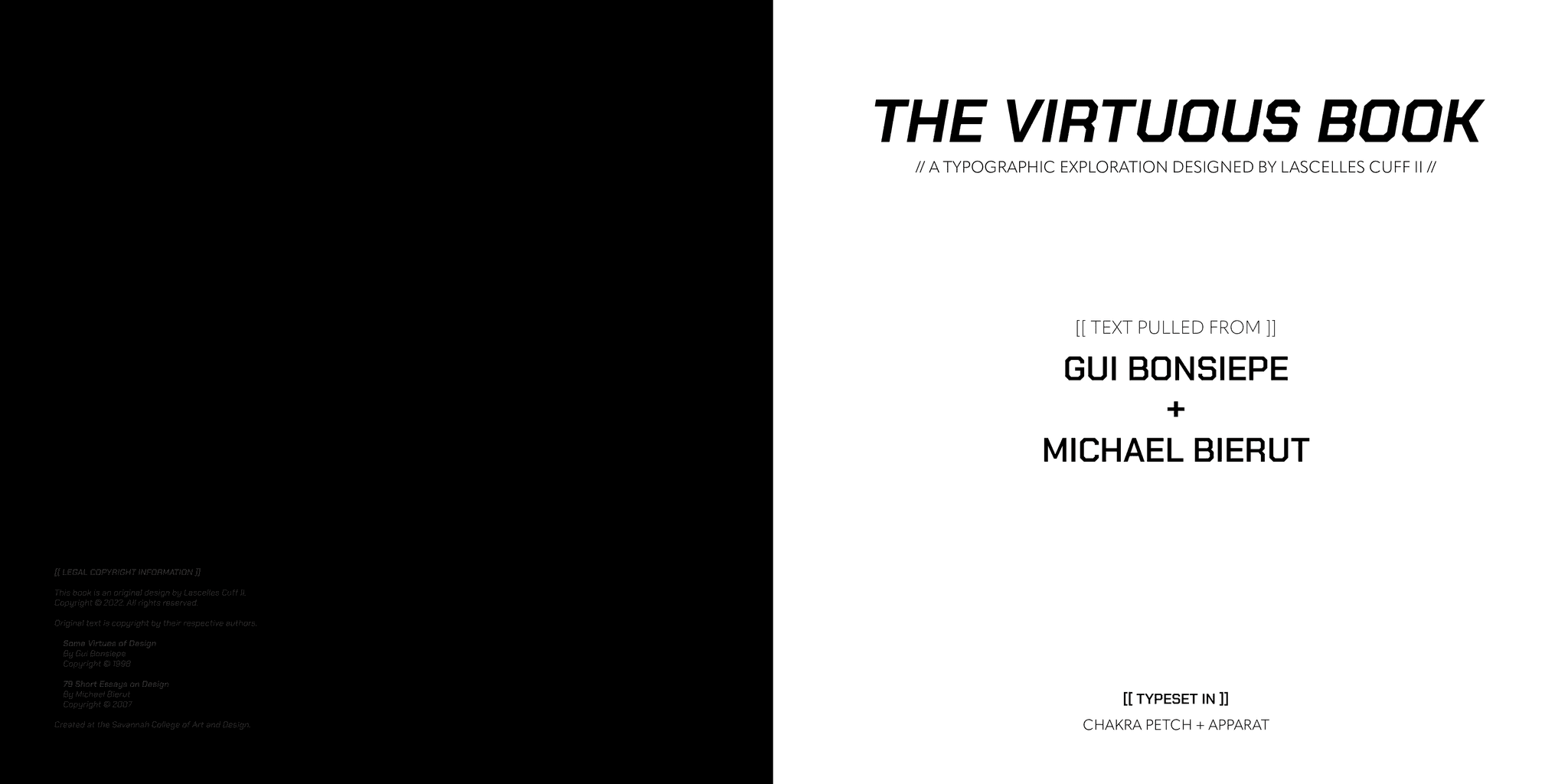
The opening spread and covers of The Virtuous Book.
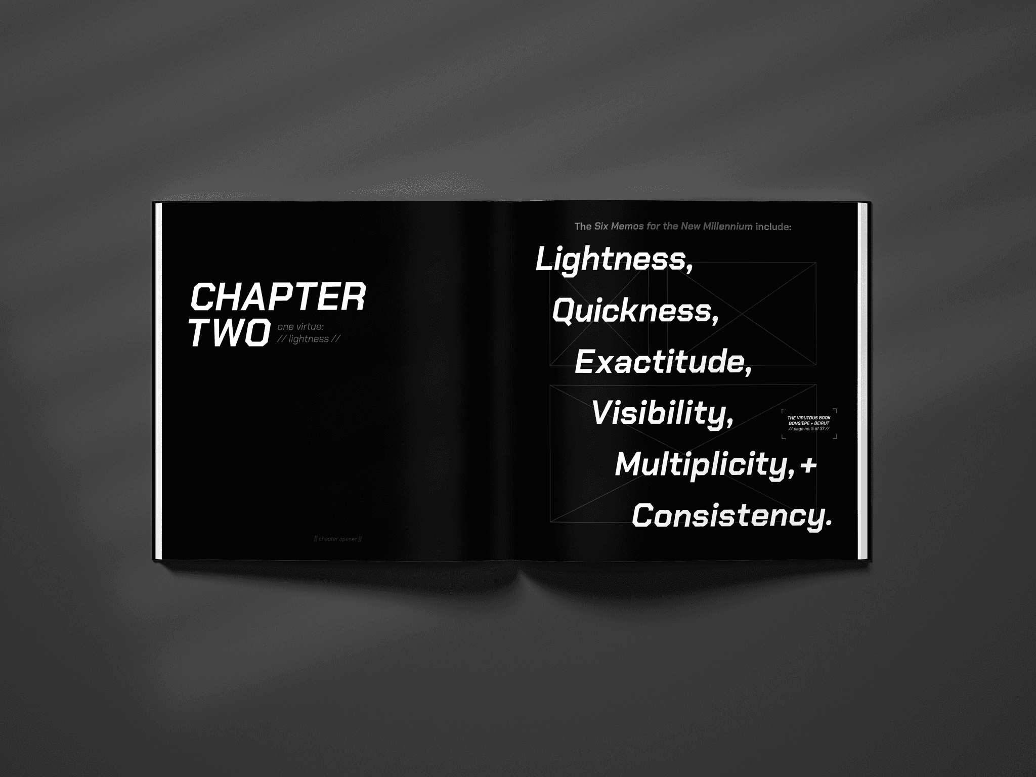
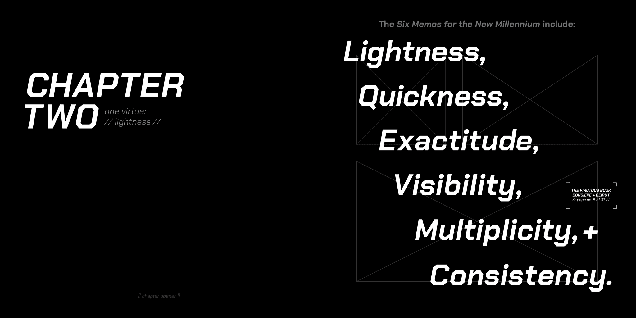
The Chapter Two opening spread: one virtue: // lightness //
Read — or skim — through some of my favorite spreads from this 52-page long exploration between type, page, and book design.

The Virtuous Book is a 52-page book created for the purposes of exploring type pairings and the flow of book design.
The Virtuous Book contains text from Gui Bonsiepe’s Some Virtues of Design and Michael Bierut’s essay, Why Designers Can’t Think, from his 79 Short Essays on Design series. Thus, The Virtuous Book itself is a catalog of design, exploring the topic visually through my page layouts, as well as contextually, through the content which can be read within.
As stated before, The Virtuous Book was created to explore type pairings. Chakra Petch and Apparat were the two type families that informed the look of The Virtuous Book. Chakra Petch is a geometrical typeface, giving a tech-forward look to the exploration. Apparat is the supporting body text — a clean, modern sans serif typeface that prioritizes readability.

Various spreads from The Virtuous Book, including the front and back covers.
The look of The Virtuous Book was mainly influenced by its primary typeface, Chakra Petch. Upon experimenting with this typeface in the project's early design stages, I knew I wanted to create a book that explored 'meta-design' as I coined it.
Meta-design looks at design itself and comments on the process, breaking the fourth wall and having the design speak towards the reader themselves. For example, empty image bounding boxes — where pictures should be — are used heavily throughout its pages. Even more, the cover exclaims 'place cover art here', crop marks become design elements, and forward slashes '//' and bracket marks '[ ]' contain information such as page numbers and chapter titles.

The front cover of The Virtuous Book.

The opening spread and covers of The Virtuous Book.

The Chapter Two opening spread: one virtue: // lightness //
Read — or skim — through some of my favorite spreads from this 52-page long exploration between type, page, and book design.

The Virtuous Book is a 52-page book created for the purposes of exploring type pairings and the flow of book design.
The Virtuous Book contains text from Gui Bonsiepe’s Some Virtues of Design and Michael Bierut’s essay, Why Designers Can’t Think, from his 79 Short Essays on Design series. Thus, The Virtuous Book itself is a catalog of design, exploring the topic visually through my page layouts, as well as contextually, through the content which can be read within.
As stated before, The Virtuous Book was created to explore type pairings. Chakra Petch and Apparat were the two type families that informed the look of The Virtuous Book. Chakra Petch is a geometrical typeface, giving a tech-forward look to the exploration. Apparat is the supporting body text — a clean, modern sans serif typeface that prioritizes readability.

Various spreads from The Virtuous Book, including the front and back covers.
The look of The Virtuous Book was mainly influenced by its primary typeface, Chakra Petch. Upon experimenting with this typeface in the project's early design stages, I knew I wanted to create a book that explored 'meta-design' as I coined it.
Meta-design looks at design itself and comments on the process, breaking the fourth wall and having the design speak towards the reader themselves. For example, empty image bounding boxes — where pictures should be — are used heavily throughout its pages. Even more, the cover exclaims 'place cover art here', crop marks become design elements, and forward slashes '//' and bracket marks '[ ]' contain information such as page numbers and chapter titles.

The front cover of The Virtuous Book.

The opening spread and covers of The Virtuous Book.

The Chapter Two opening spread:
one virtue: // lightness //
Read — or skim — through some of my favorite spreads from this 52-page long exploration between type, page, and book design.


