April 2022
Sweet+Simple
A sweet tea drink like no other.
Package Design, Branding & Identity, Graphic Design
April 2022
Sweet+Simple
A sweet tea drink like no other.
Package Design, Branding & Identity, Graphic Design
April 2022
Sweet+Simple
A sweet tea drink like no other.
Package Design, Branding & Identity, Graphic Design
Sweet+Simple (pronounced sweet and simple) is an imagined sweet tea brand created in April of 2022. As a designer, I wanted to explore package design, and Sweet+Simple is the product of my design curiosity.
Sweet+Simple positions itself as a new kind of sweet tea beverage. It aims to distance itself from a sea of competitors by being a lighter take on the usual heaviness of sweet tea. On top of this, infusing our tea with unique flavors such as Dragon Fruit gives us a competitive edge over many others in the same space.
From our product description: "Sweet+Simple provides the comforting taste of age old sweet tea — to a lighter degree — with refreshing fruit flavors, such as Lemon, Mango, and our own exciting infusion, Dragon Fruit."
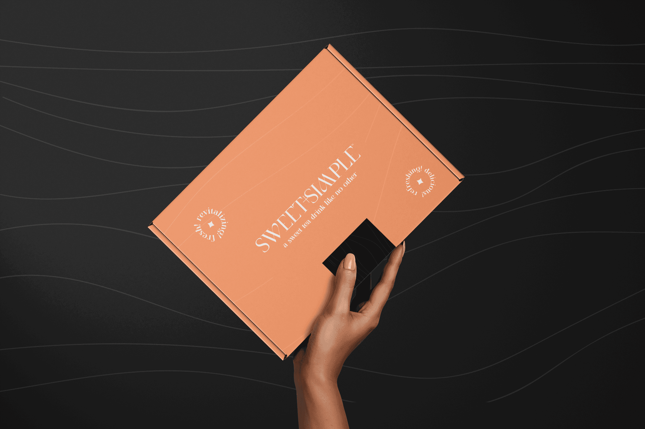
A product shipper including all three flavors of Sweet+Simple.
To further distance itself from other southern-born sweet tea brands, I branded Sweet+Simple with a modern and high-class look. This was achieved through the use of elegant typefaces such as Saint Monica and Michelle Elegant, a minimalistic line pattern, and unique motifs, such as our circle seals and flavor iconography.
Our minimalistic line pattern provided some needed visual interest to the backgrounds of our products, without being too overbearing, matching the principles of Sweet+Simple. Our circle seals include words such as 'refreshing!', 'revitalizing!', and 'delicious!' to sell the idea of this new beverage to prospective customers. Lastly, a light orange became the company's primary brand color, matching our Mango flavor, and gives vibrancy to our product shipper.
Sweet+Simple's three beautiful flavors: Dragon Fruit, Mango, and Lemon.
The full scope of this project included the branding and identity for this new beverage brand, the package design of our three flavors, and a product shipper to get Sweet+Simple in the hands of as many new customers as possible.
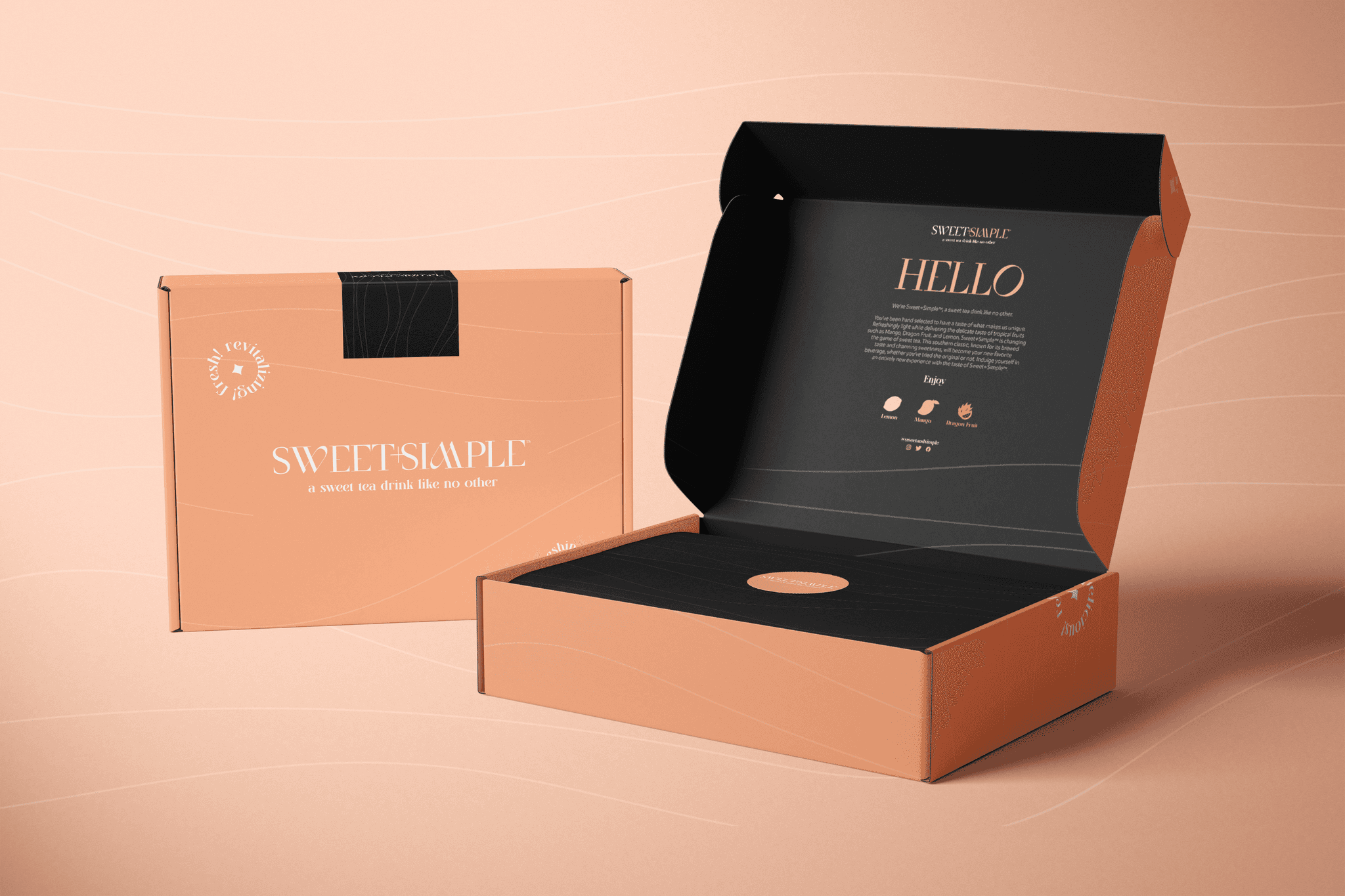
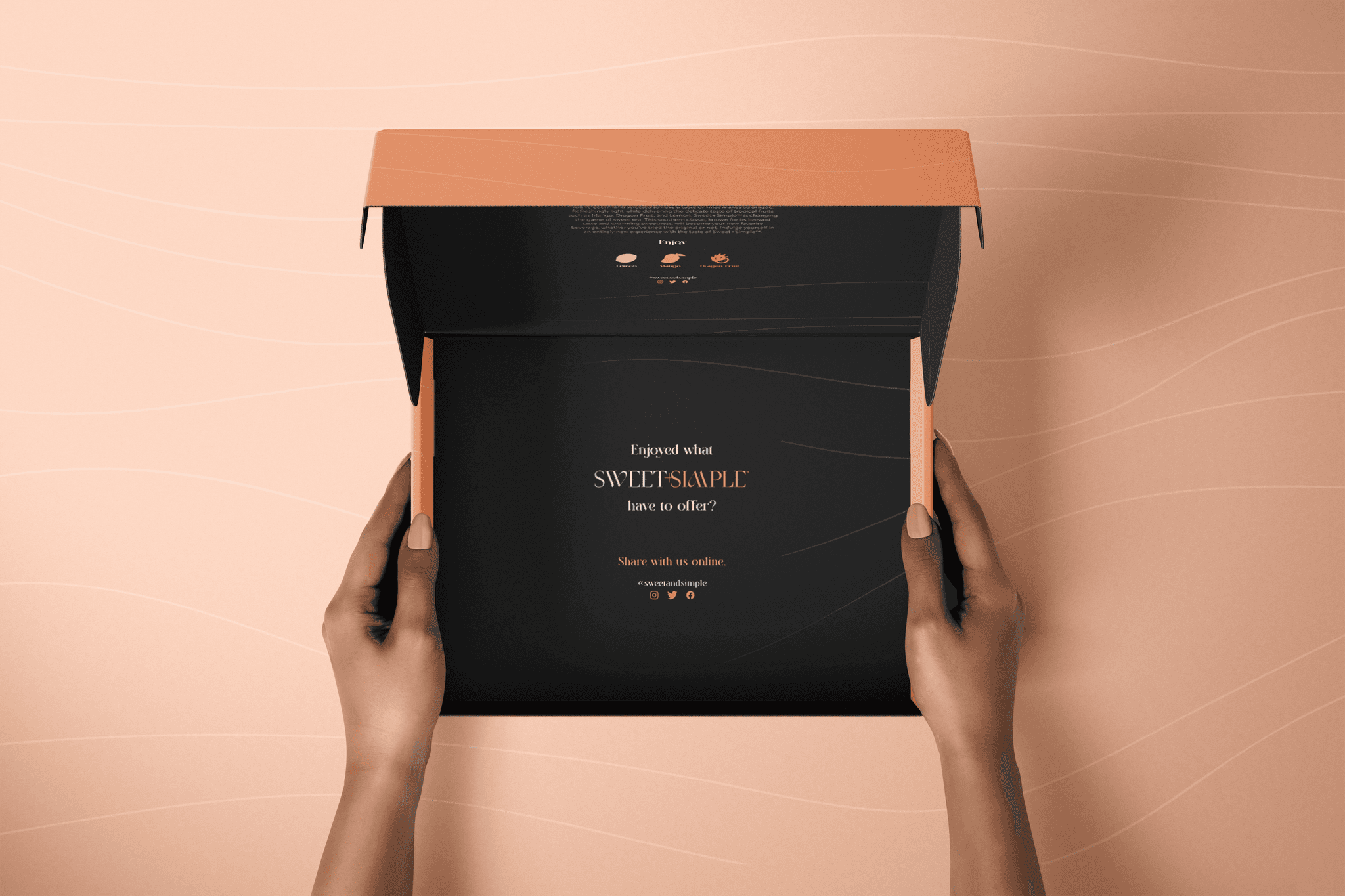
Sweet+Simple's 3-bottle product shipper.
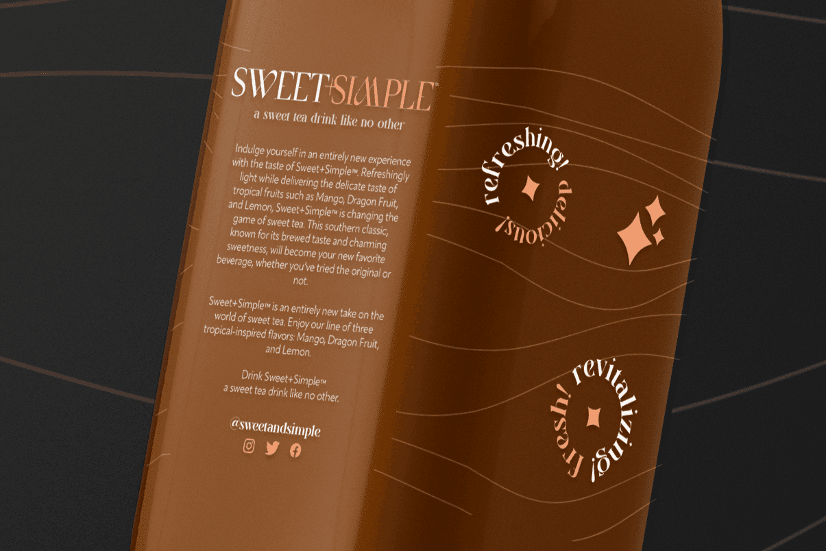
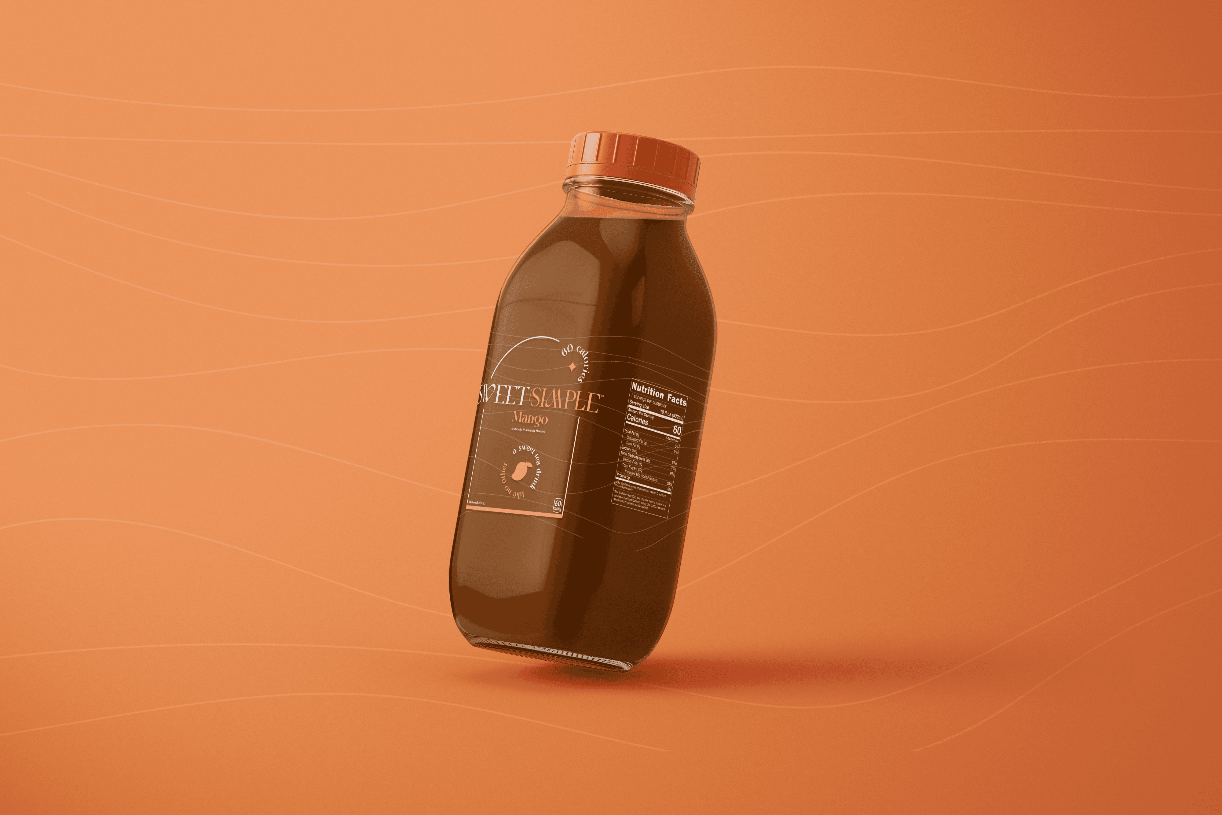
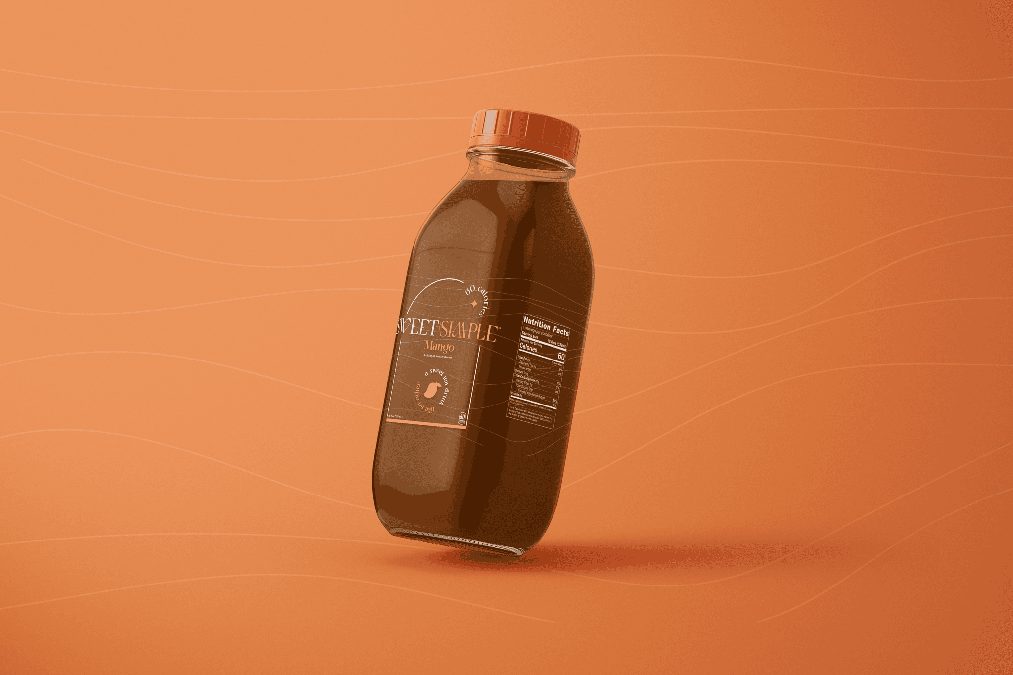
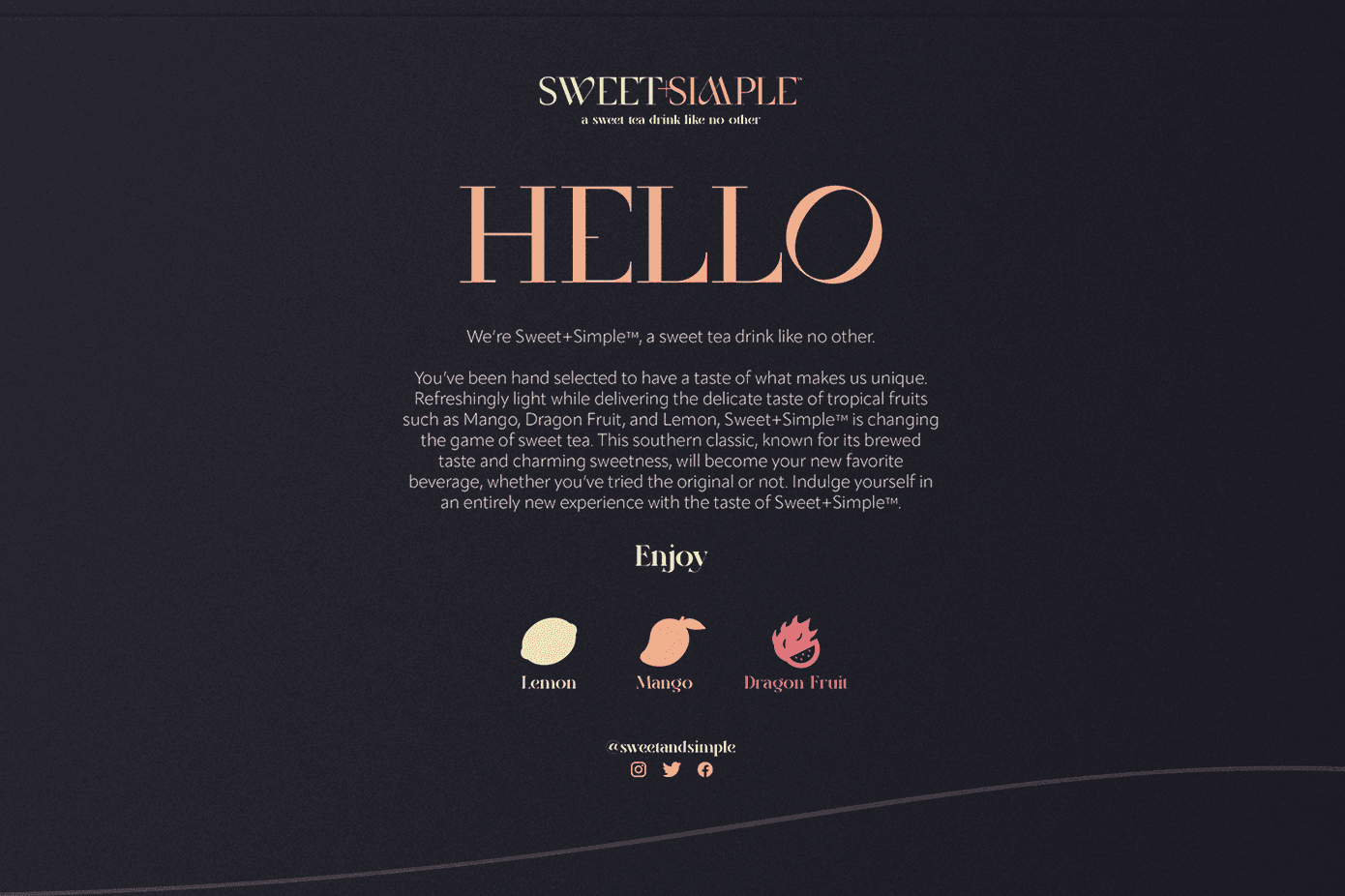
The back of our Mango flavor, featuring a brand and product description.
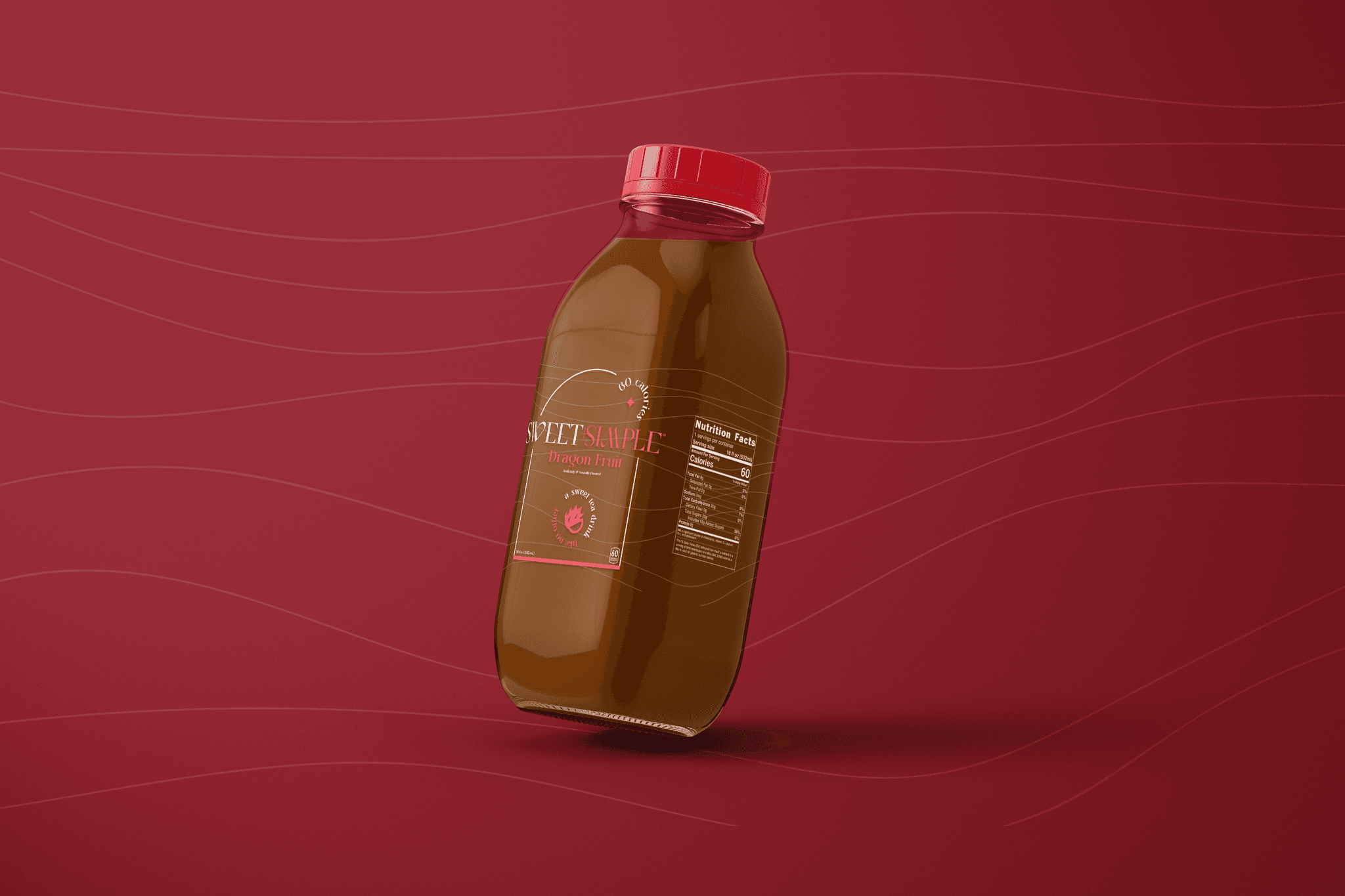
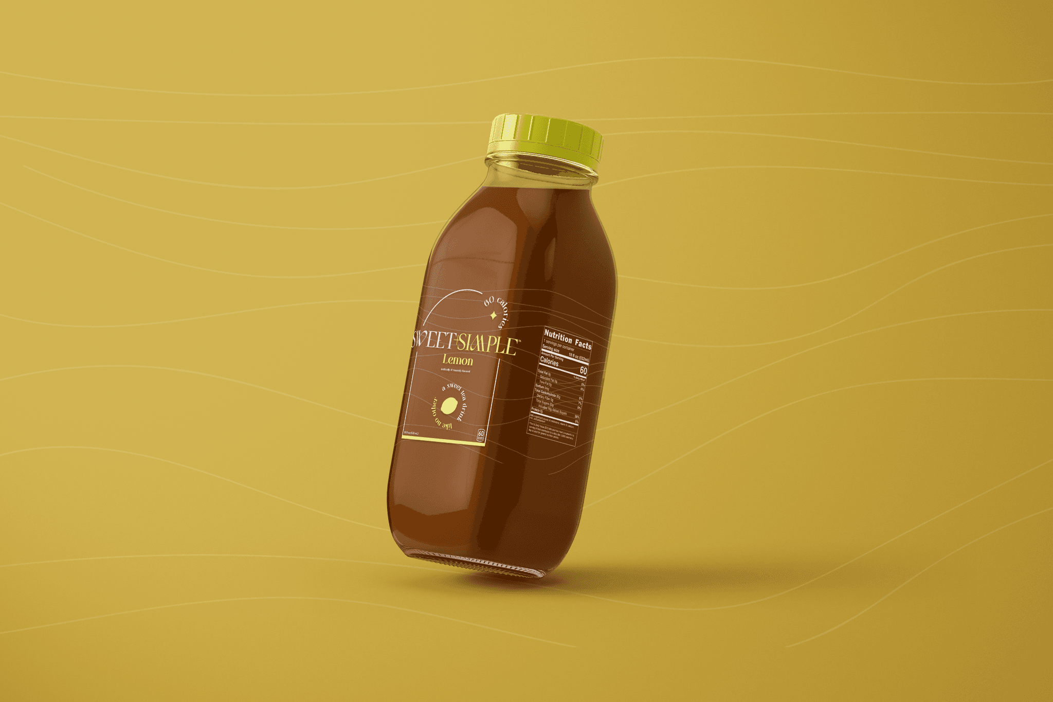
Full images of all three Sweet+Simple flavors.

Sweet+Simple (pronounced sweet and simple) is an imagined sweet tea brand created in April of 2022. As a designer, I wanted to explore package design, and Sweet+Simple is the product of my design curiosity.
Sweet+Simple positions itself as a new kind of sweet tea beverage. It aims to distance itself from a sea of competitors by being a lighter take on the usual heaviness of sweet tea. On top of this, infusing our tea with unique flavors such as Dragon Fruit gives us a competitive edge over many others in the same space.
From our product description: "Sweet+Simple provides the comforting taste of age old sweet tea — to a lighter degree — with refreshing fruit flavors, such as Lemon, Mango, and our own exciting infusion, Dragon Fruit."

A product shipper including all three flavors of Sweet+Simple.
To further distance itself from other southern-born sweet tea brands, I branded Sweet+Simple with a modern and high-class look. This was achieved through the use of elegant typefaces such as Saint Monica and Michelle Elegant, a minimalistic line pattern, and unique motifs, such as our circle seals and flavor iconography.
Our minimalistic line pattern provided some needed visual interest to the backgrounds of our products, without being too overbearing, matching the principles of Sweet+Simple. Our circle seals include words such as 'refreshing!', 'revitalizing!', and 'delicious!' to sell the idea of this new beverage to prospective customers. Lastly, a light orange became the company's primary brand color, matching our Mango flavor, and gives vibrancy to our product shipper.
Sweet+Simple's three beautiful flavors: Dragon Fruit, Mango, and Lemon.
The full scope of this project included the branding and identity for this new beverage brand, the package design of our three flavors, and a product shipper to get Sweet+Simple in the hands of as many new customers as possible.


Sweet+Simple's 3-bottle product shipper.

The back of our Mango flavor, featuring a brand and product description.
Full images of all three Sweet+Simple flavors.

Sweet+Simple (pronounced sweet and simple) is an imagined sweet tea brand created in April of 2022. As a designer, I wanted to explore package design, and Sweet+Simple is the product of my design curiosity.
Sweet+Simple positions itself as a new kind of sweet tea beverage. It aims to distance itself from a sea of competitors by being a lighter take on the usual heaviness of sweet tea. On top of this, infusing our tea with unique flavors such as Dragon Fruit gives us a competitive edge over many others in the same space.
From our product description: "Sweet+Simple provides the comforting taste of age old sweet tea — to a lighter degree — with refreshing fruit flavors, such as Lemon, Mango, and our own exciting infusion, Dragon Fruit."

A product shipper including all three flavors of Sweet+Simple.
To further distance itself from other southern-born sweet tea brands, I branded Sweet+Simple with a modern and high-class look. This was achieved through the use of elegant typefaces such as Saint Monica and Michelle Elegant, a minimalistic line pattern, and unique motifs, such as our circle seals and flavor iconography.
Our minimalistic line pattern provided some needed visual interest to the backgrounds of our products, without being too overbearing, matching the principles of Sweet+Simple. Our circle seals include words such as 'refreshing!', 'revitalizing!', and 'delicious!' to sell the idea of this new beverage to prospective customers. Lastly, a light orange became the company's primary brand color, matching our Mango flavor, and gives vibrancy to our product shipper.
Sweet+Simple's three beautiful flavors: Dragon Fruit, Mango, and Lemon.
The full scope of this project included the branding and identity for this new beverage brand, the package design of our three flavors, and a product shipper to get Sweet+Simple in the hands of as many new customers as possible.


Sweet+Simple's 3-bottle product shipper.

The back of our Mango flavor, featuring a brand and product description.
Full images of all three Sweet+Simple flavors.


